The benefits of infinite scroll are real… it can boost your time on site, increase page views, and improve user experience – all while lowering your bounce rate.
Infinite scroll (also known as endless scrolling, lazy loading, and continuous scrolling) eliminates the need for pagination by constantly loading new content as a user scrolls down the page.
Sounds interesting? Keep reading and I’ll get into some of the high-level benefits of infinite scroll and then show you some of the best examples of infinite scroll in the wild.
Benefits of Infinite Scroll

If you’re on Facebook or Twitter, you may have intuitively noticed some of the benefits of infinite scroll. Would you be as addicted to your Facebook news feed if you had to click to the next page after every ten posts? Probably not.
But Facebook isn’t the only one who can benefit. Here are a few ways infinite scroll can improve your site.
Lower Your Bounce Rate
Your bounce rate is basically the percentage of visitors who leave your site without clicking on anything or viewing another page. When Time.com moved to infinite scroll, they lowered this number by 15%.
That means 15% of people who would’ve left after their first page view were now getting deeper into Time’s website content.
Wouldn’t you like to keep 15% more visitors?
Boost Your Time on Site
There’s a reason all the major social content providers have gone infinite scroll. It makes their sites addictive. People lose themselves in content and stay on the site for what seems like forever.
Facebook, Twitter, Pinterest, Tumblr… All infinite scroll websites.
Do you know the average visit length on Facebook? It’s massive – twenty minutes! Now, I’m not going to promise you an average time on site of twenty minutes if you move to infinite scroll.
But you can definitely increase your time on site by providing users a more seamless way to engage with content.
Get Users Deeper Into Your Site
With infinite scroll, you can also increase the number of content pieces that people interact with (also known as page depth).
In the same redesign I mentioned earlier, Time.com found that, among desktop users, 21% more were moving on to another piece of content.
NBC News noticed a similar effect in their infinite scroll redesign. Desktop users were visiting 20% more pages per visit with infinite scroll.
Those numbers are pretty consistent, aren’t they?
Infinite scroll can mean more pages per visit. And that means more engaged visitors, which is a big win for you.
Improve Your User Experience
This one isn’t quite as cut and dry as the previous benefits. There are experts who argue both sides of the issue here. I’m only going to list the argued benefits here. In the next section, I’ll get into some of the proposed negatives to give a balanced view.
With that caveat, here are some of the major UX benefits of infinite scroll:
- Fewer clicks
Scrolling is easier for users than clicking (and then scrolling again) and requires less action. - Better content exposure
Infinite scroll lets users find content they might not otherwise see. - Great for mobile
Infinite scrolling is especially beneficial for any mobile or touch users.
Drawbacks of Infinite Scroll
I don’t want to make it seem like everything is rainbows and sunshine. There are some critics who will say the benefits of infinite scroll are overblown.
Some experts argue that it:
- Eliminates the feeling of completion
Users like the sense of completion that’s achieved when they reach the end of a page. - No footer
Infinite scrolling makes it hard to reliably display a footer. - Not good for uneven information importance
Infinite scroll puts all information on a level field – this isn’t good if the information has different hierarchies of importance.
Infinite Scroll in the Wild
Some major sites have recognized the benefits of infinite scroll. I already mentioned the big social networks, so let’s take a quick look at some news organizations who have made the switch.
Slate Goes Infinite Scroll

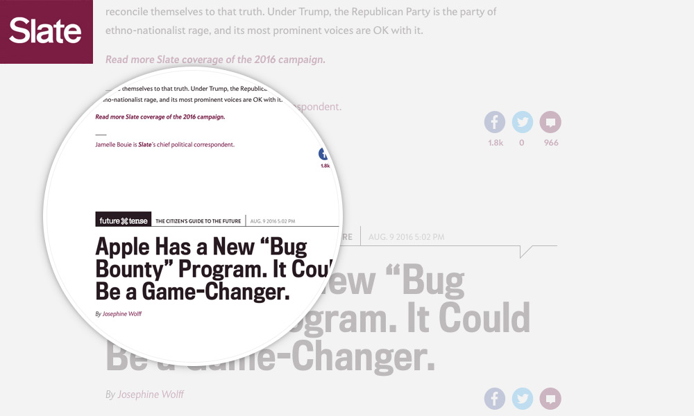
A few months ago, Slate made the decision to move to infinite scroll for their articles. They claim to have made the switch so users can move between different pieces of content more easily. Interestingly, they said the only reason they held onto pagination for so long was because it increased ad views.
Infinite scroll makes it easier to read the piece you’re on, and then makes it easier to read the next…
They’re hoping that the benefits of increased page views more than offsets the loss of pagination ad views.
Bloomberg Business Infinite Scrolls with Personalization

Bloomberg Business went infinite scroll in 2015. But they put a bit of a twist on it. Rather than showing articles chronologically, Bloomberg tries to personalize the infinite scroll content by filling the scroll with articles their algorithm ranks as most relevant.
It’s a combination of engagement and view-ability – ultimately, what advertisers want to do is connect to the consumer.
Combining content personalization with the benefits of infinite scroll is definitely a smart approach.
Wrapping Things Up
Infinite scroll won’t work for every single website out there. If your site presents lots of information with different levels of importance, you should probably stick with a paginated layout.
But for sites presenting content with similar levels of importance, infinite scroll makes a great option. It will get readers more engaged with your site and give them a better user experience. If you use WordPress, it’s also easy to implement with a plugin like Ajax Load More, so you can test infinite scroll out without committing a ton of time.
What do you think? Why not give infinite scroll a try and see if it boosts your readers’ engagement?
